
News & Insights
News
Insights
Recent Posts
- Turn Raw Data Into Actionable Insights With Dashboard Reporting
- Stress Testing: A Smart Way to Manage Today’s Business Risks
- Midyear Tax Planning: Review Opportunities to Save Taxes This Year (or Next)
- Selecting a Tax Accounting Method for Your Small Business
- How a Financial Statement Audit Strengthens Your Fraud Defenses
- Form 990: Potential Upcoming Changes and What They Mean for Nonprofits
- Expand Your Nonprofit’s Donor Base with Giving Circles
- Will Your Social Security Benefits be Taxable?

Data Dashboard & Visualizations: Utilizations for Success


Have you ever felt lost in a sea of data – trying to make sense of numbers from various spreadsheets, emails and messy dashboards that don’t integrate with one another? You’re not alone. Data overload, a highly technical consulting term, has become a common headache for organizations of all kinds.
As companies map out their strategic plans, making sense of big data has become a top priority. Data dashboards are no longer buzz words; they have become critical tools that help leaders make smarter business decisions.
How do companies make sense of all the data and build meaningful dashboards?
Prioritizing user-friendly dashboard design can make a data dashboard more accessible and encourage a better understanding and engagement with data. Solid dashboards can help summarize and connect data in a way that tells a story – and can inform your organization’s next move.
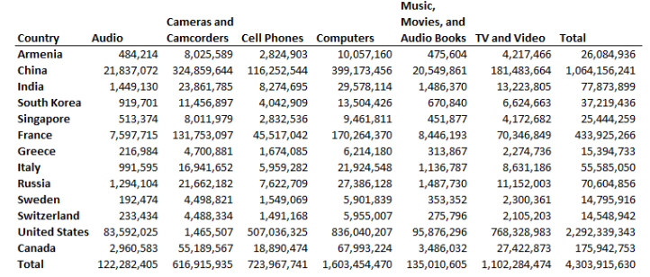 Now, let’s try it with a visual.
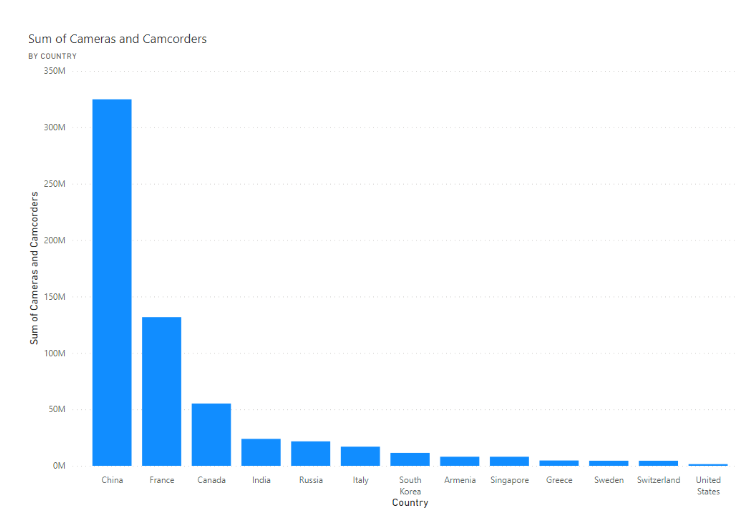 Visuals speed up information processing by turning complex data into easy-to-understand visuals that tell a clear story. This helps companies make informed decisions faster and spot trends more easily. While the example focuses on one data source, you can combine data from multiple sources to create a more comprehensive dashboard.
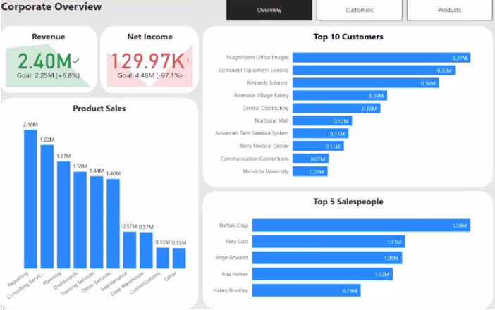
The Power of Data Dashboards and Visualizations
Data is a powerful tool in your organization’s toolbox. Whether financial metrics, qualitative insights, or a blend of both, the true power of adopting a data-centric approach begins with the clarity provided in visualizations and data dashboards. Visual representations uncover the stories within data, translating complex information into accessible formats, especially when identifying patterns or trends. Here are some examples of what effective dashboards can provide for your business.- Insightful Decision-Making: A data dashboard offers insights into operations, customer behavior, market trends, and more. By analyzing the data, you can make informed decisions that drive growth and success.
- Resource Optimization: Dashboards can allow you to track resource utilization, whether it’s human resources, inventory, or finances. By closely monitoring resource allocation, areas of inefficiency or excess can be optimized for maximum productivity and cost-effectiveness.
- Customer Insights and Personalization: Gain insights into customer behavior, preferences, and demographics. With this, you can tailor your products, services, and marketing efforts to meet individual needs, driving customer satisfaction and loyalty.
- Enhanced Communication and Collaboration: Data dashboards facilitate communication and collaboration across teams and departments by providing a shared platform for accessing and understanding data. This fosters alignment towards common goals, encourages data-driven discussions, and promotes a culture of transparency and accountability within the organization.
Now, let’s try it with a visual.
Visuals speed up information processing by turning complex data into easy-to-understand visuals that tell a clear story. This helps companies make informed decisions faster and spot trends more easily. While the example focuses on one data source, you can combine data from multiple sources to create a more comprehensive dashboard.
Working Backward
The true power of data is not in the mere ability to create a dashboard, rather in determining what story the dashboard should tell. The process should not start with a data source and haphazardly creating a dashboard. Instead, it should begin with the problem or desired conclusion in mind, working backward to pinpoint the relevant data sources and visualizations that will aid you. Once this has been completed, you’ll get to pinpoint a wide range of data sources within your company.- Internal Systems
- External Databases
- Web Analytics
- Social Media Platforms
- Surveys and Feedback
- Financial Data
How Can Maner Costerisan Help You?
The utilization of a data dashboard is pivotal for growth. From strategy to implementation, Maner Costerisan can assist you in envisioning, delivering, and running your organization using the latest technologies. Our data analytics team will help to clarify data vagueness and use cutting-edge tools to dive deep into your data, unraveling complexities and transforming them into actionable insights. Reach out to us at maner@manercpa.com or by calling us at 517-232-7500.The materials provided in the News & Insights section are for general informational purposes only and may not reflect the most current legal, tax, or financial developments. While we strive to ensure accuracy at the time of publication, Maner Costerisan does not guarantee that the information remains up-to-date or free from error. We recommend consulting directly with a Maner Costerisan team member to confirm the applicability and relevance of any information to your specific situation.